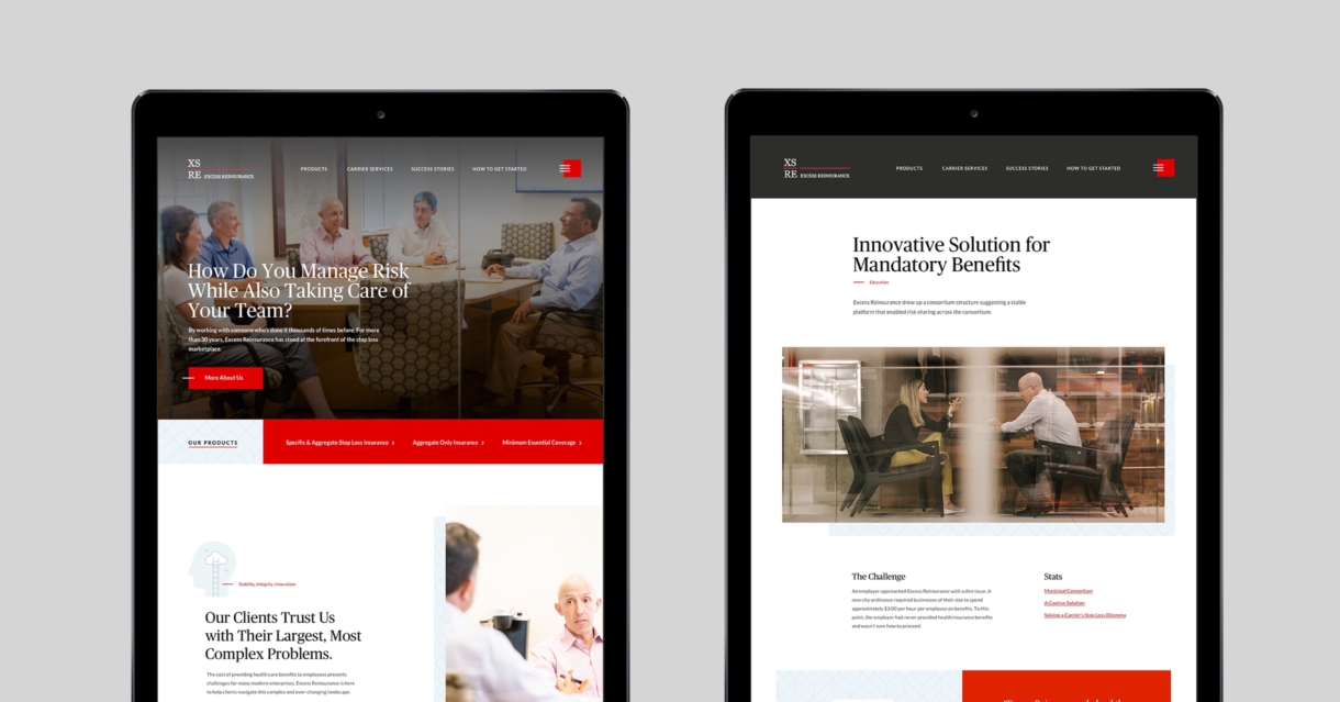
Excess Reinsurance

ExcessRe approached Whitepenny with a very specific issue: help define the brand messaging in a way that simplifies the complexity of their work while also recognizing that the company is communicating with a very specific end-user.

Project Goal

Showcase the deep domain expertise of the company and align the brand to match that expertise.

The Solution

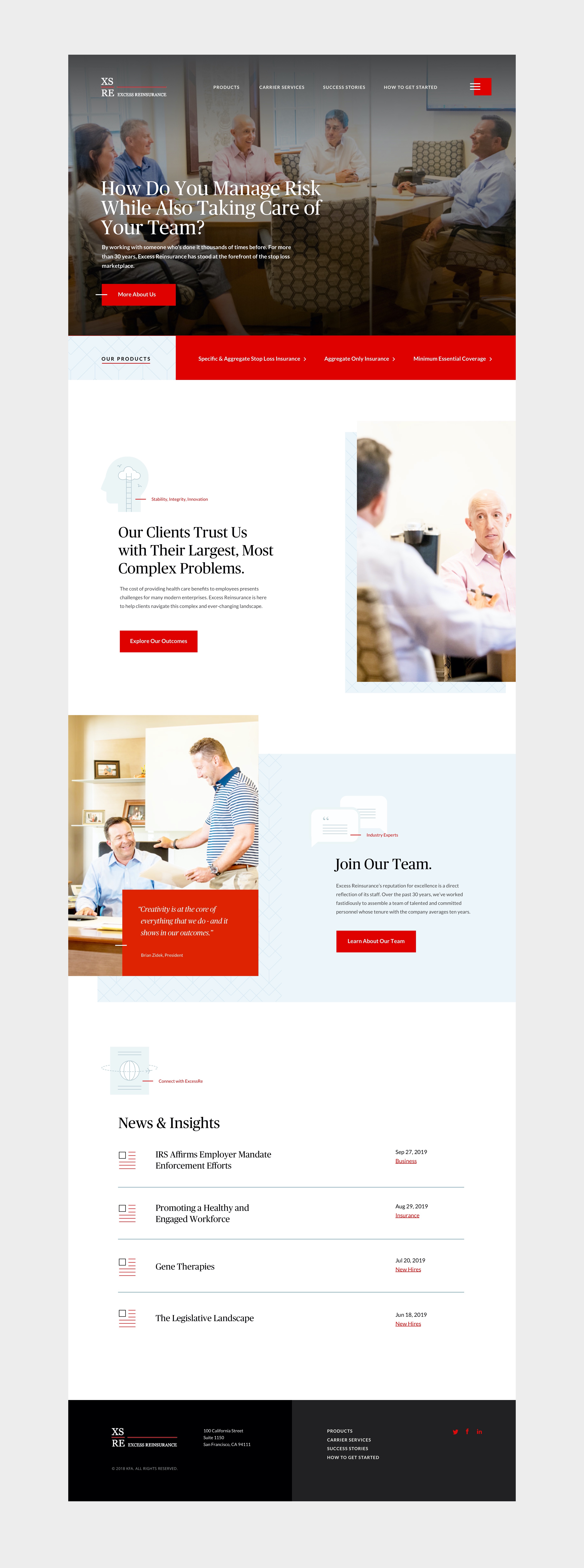
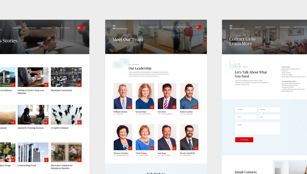
At the core of the ExcessRe strategy was segmenting users into clear categories. The company has a suite of customized products that is has developed, and it also has a range of offerings that are built for partner relationships. By providing more clarity around ‘what they offer’ the company was better positioned to sell to the unique pain points of their constituencies.

What We Did

  • Strategy
  • Brand Messaging
  • Custom Illustration
  • Website Development

We believe that branding is a comprehensive experience. Message, visual design, content, digital – all aspects need to be purposeful and aligned with who you are.

WHITEPENNY

Illustration

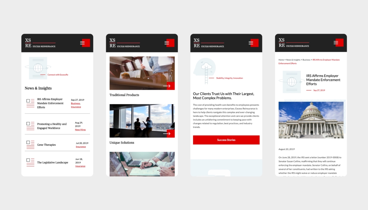
A series of custom illustrations were developed to help speak to a range of core messaging themes. The style helped provide another layer of differentiation for the brand and allowed for a site that contained both photography and illustration.

Photography

The ExcessRe building is a beautifully renovated old bank building, so the decision was made to showcase the space as a part of the brand. A photo shoot brought both the team and the space into the overall brand strategy.
The Outcome

The ExcessRe site helped the company provide much needed clarity around the work they do and the impact of that work. By viewing the site through the lens of the consumer, the company was able to develop a series of case studies that helps show the impact and scope of their work.

Takeaway

A customized approach (from illustrations to photography) was built to showcase the customized nature of the brand.