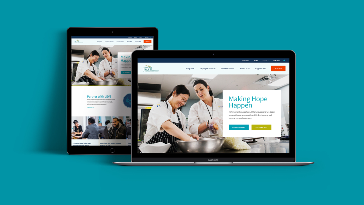
The moment your homepage loads, people begin passing judgments on your business. Consumers assume that what they see on your website reflects the quality of the product or service you sell. Someone may come across a lousy website for a service business and think ‘This is a lousy service business.’ They may think you’re not successful enough for a web design budget or not savvy enough to know the importance of a solid online presence. Branding is all about controlling the user’s experience. Good branding ensures there isn’t a time when someone visits your site, looks around, and leaves because your business appears incompetent. If your product is awesome, but you lose people because your website is not, then your website is not doing its job. By incorporating these four key attributes into the makeup of your online presence, you can make sure your website is doing its job.
1. Talk to your users, not yourself.
Companies often use their website’s content to affirm what the company already knows about itself, thus neglecting the needs of those who are trying to learn more. Here’s the hardest thing for many businesses to realize: your website isn’t about you. Good branding is about asking good questions. Why is your user coming to your site? What pain point does your service or product resolve?
If you begin by identifying your user, you’re in a far better position to speak to that user’s needs. Allow your website to talk to your user, identifying the need your product or service addresses.
2. Make your takeaway message clear.
Assume your viewers won’t read your content. If someone clicks on your homepage and gives it a quick scan, what will they know about your company? Your branding should provide a quick and clear snapshot of who and what your business or service is.
Look at your website. What would your visitors say? “Oh, that’s Soxie. They’re a quirky sock company that appeals to energetic millennials?” In a glance, your users should be able to say: “Oh, [BUSINESS NAME]. That’s the [BLANK] company.” Make filling in that blank super simple.
3. Align your site aesthetic with your brand strategy.
Make sure your branding and website messaging are consistent. If you use words like progress and innovate, then your site needs to feel progressive and innovative. If you’re the trusted corporate partner, then your site needs to reflect that dependability.
The great thing about brand strategy is that you get to choose your positioning — the only mistake is not aligning your story and image with who you actually are.
4. Make their next steps easy.
What do you want a visitor to do as a result of coming to your website? If you’re handling your SEO well, the right search terms — whether that’s “best catered pasta” in the area or “most natural yoga mat” — will bring them to you. Then what?
What should he or she do next? You may urge your guests to click a link and schedule a spaghetti sampling for their next big event. Or you might provide a list of local retailers and encourage your user to go test out your yoga mat. Give your users easy ways to connect. Make your “Call to Action” one that is an enjoyable extension of your website, leading your user closer to becoming a client or customer.
Your Website Is Your Brand
Is your website helping or hurting your business — drawing people in or discouraging users from giving you a second thought? Your website’s purpose is to increase the consumer’s interest and minimize the number of potential customers or clients that pass you by. If you need help assessing the effectiveness of your website, call or email us today to schedule a consultation.]]>


