Bricco

Marrying the old with the new is never an easy task, so when Bricco approached WP to help create the brand for their new flagship restaurant location in Philly’s recently renovated Bourse building, we were excited to take on the challenge.

Project Goals

Bring traditional Roman styles into a modern pizza brand.

The Solution

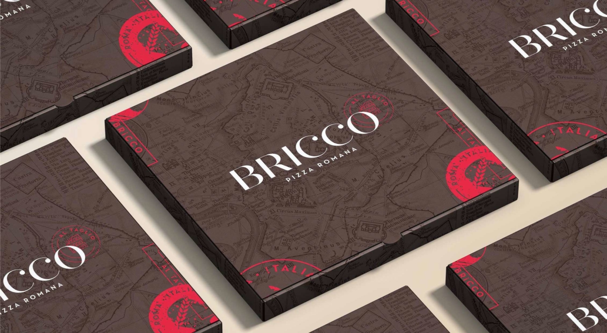
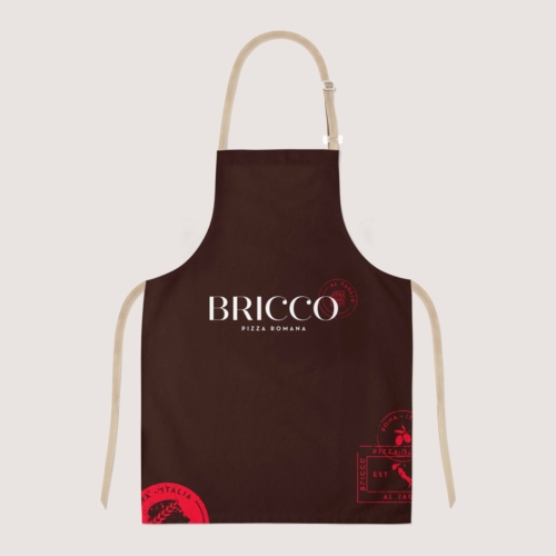
The resulting brand pulls from elements of traditional Roman iconography while introducing a more contemporary palette and general brand aesthetic. A full suite of supporting brand language was developed so that Bricco could easily use its custom brand art across its assets: boxes, shirts, and aprons. The new location and brand came out swinging, and we weren’t surprised at all to hear that Bricco finished fifth at International Pizza Expo in Las Vegas.

What We Did

  • Strategy
  • Brand Style Guide
  • Logo Design
  • Restaurant Assets

We believe that branding is a comprehensive experience. Message, visual design, content, digital – all aspects need to be purposeful and aligned with who you are.

WHITEPENNY
Brand Application

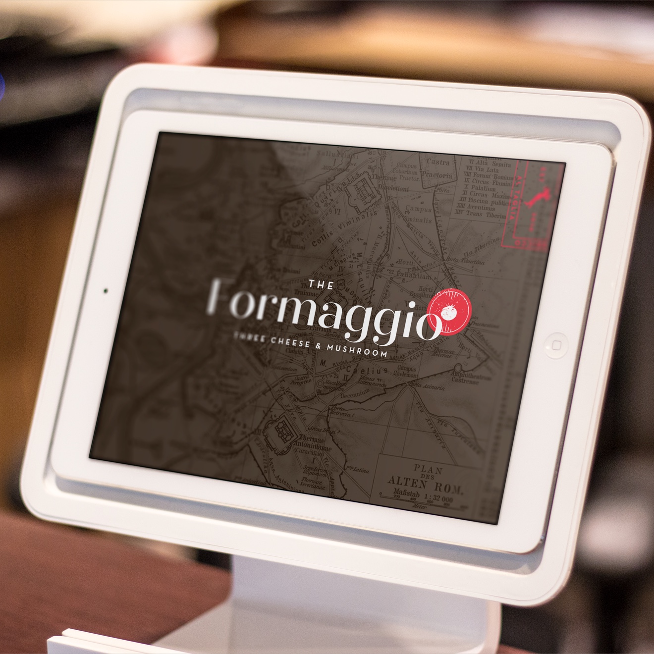
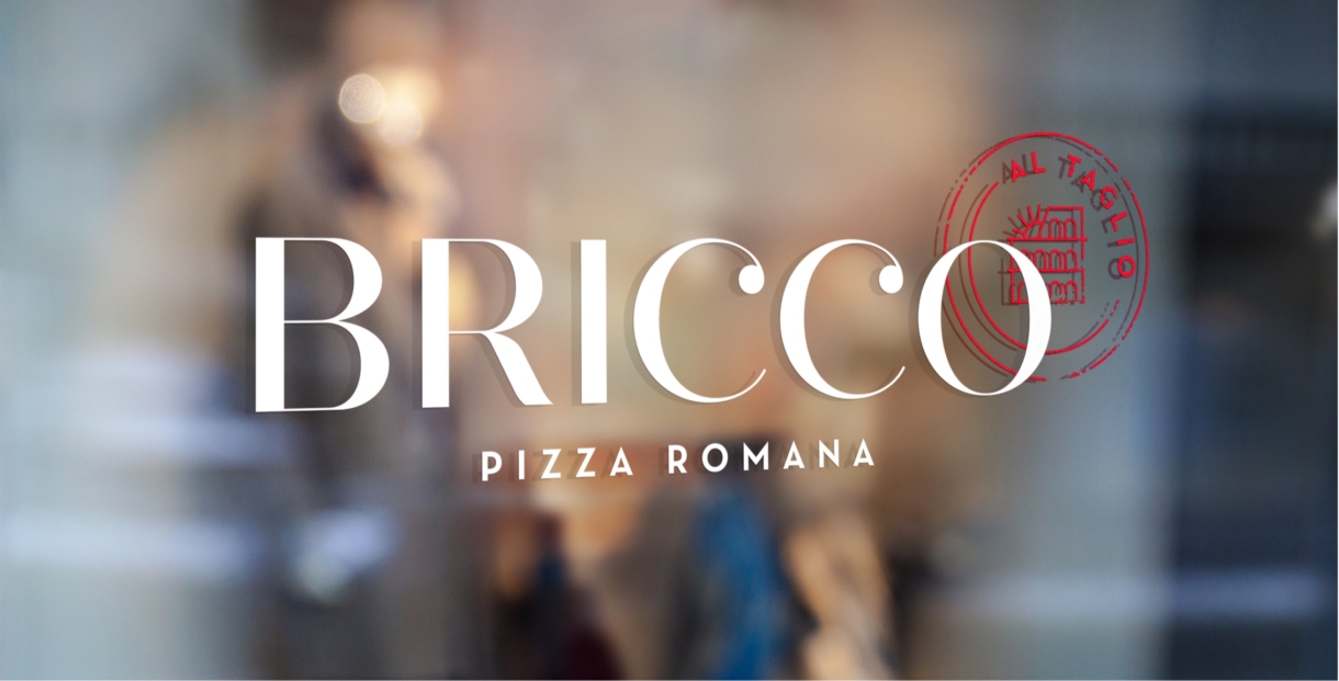
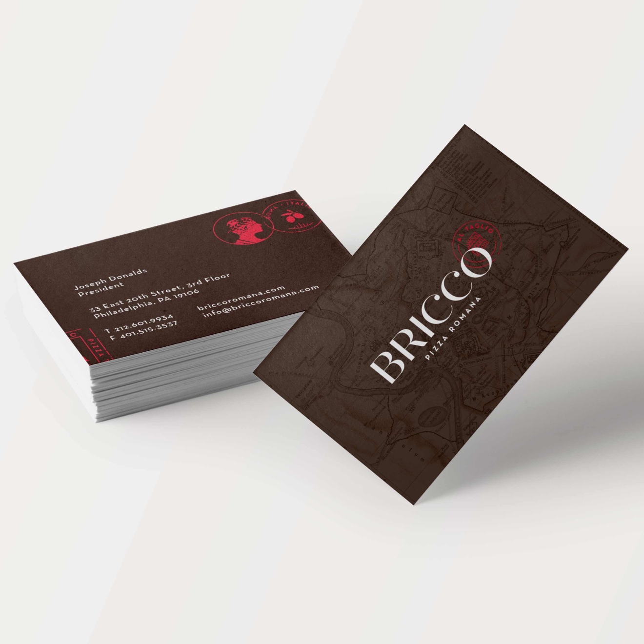
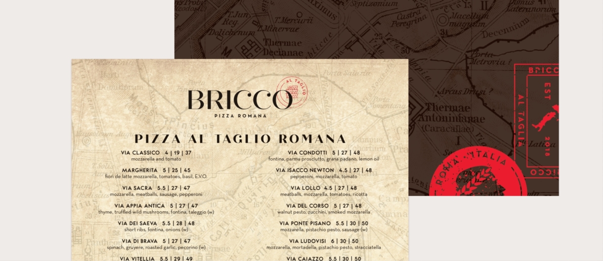
When a brand has a physical space, there is a great opportunity to introduce a wide range of assets that align with the brand strategy. For Bricco, we were able to execute everything from POS screens to signage, from menus to aprons.
Custom Stamps

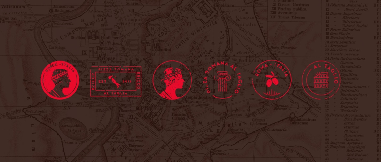
A series of custom stamps were developed that were built from traditional Roman imagery – and allowed Bricco to have secondary brand assets that could be used as standalone elements.
The Outcome

The brand launched its Philadelphia location to great reviews – and was able to marry the authenticity of the brand with what authenticity of its product.

Takeway

The marriage of old and new clearly signaled that Bricco had a serious approach to its craft while also appealing to a wider and younger demographic.