We believe that branding is a comprehensive experience. Message, visual design, content, digital – all aspects need to be purposeful and aligned with who you are.
WHITEPENNY
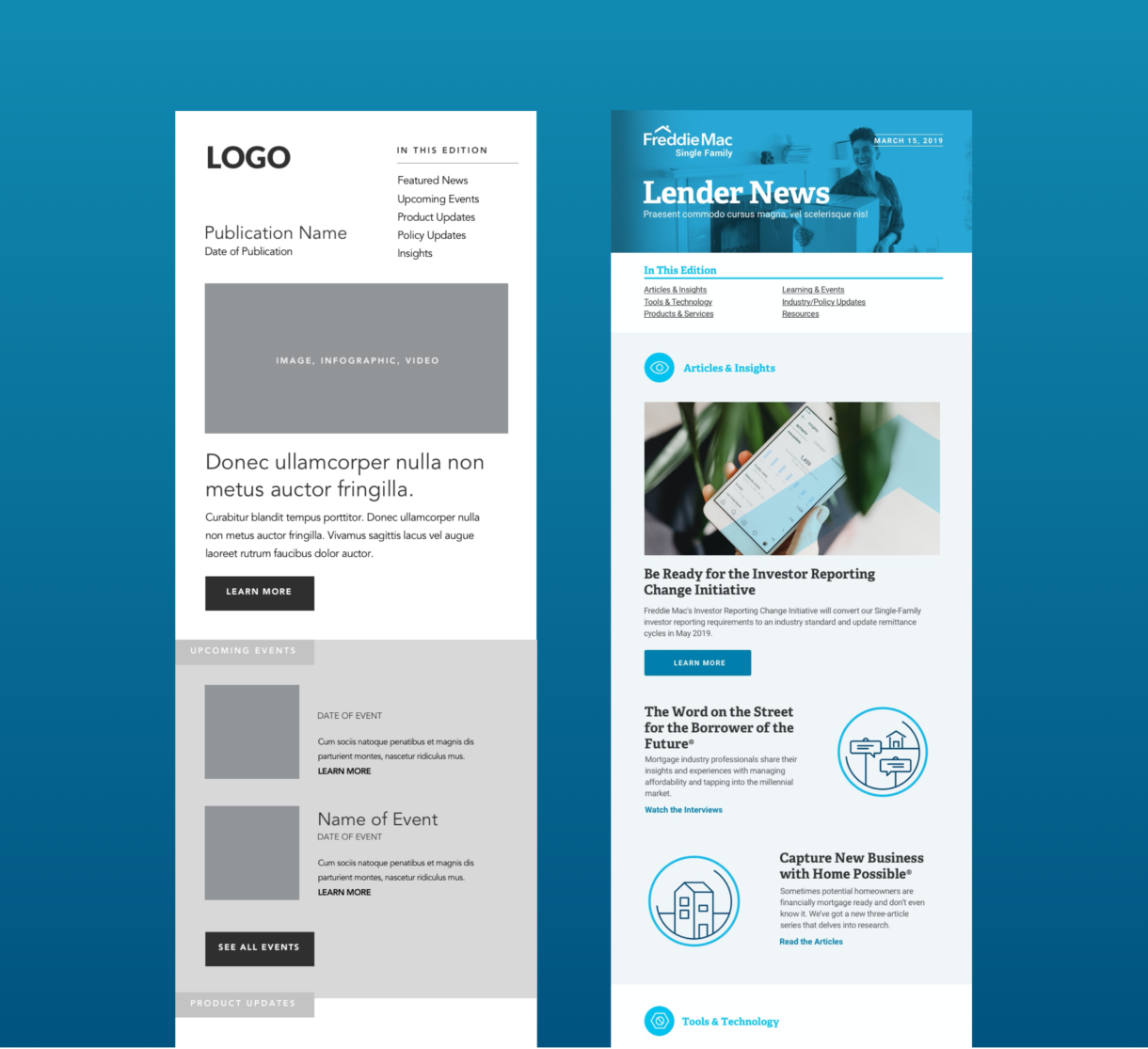

Illustrations
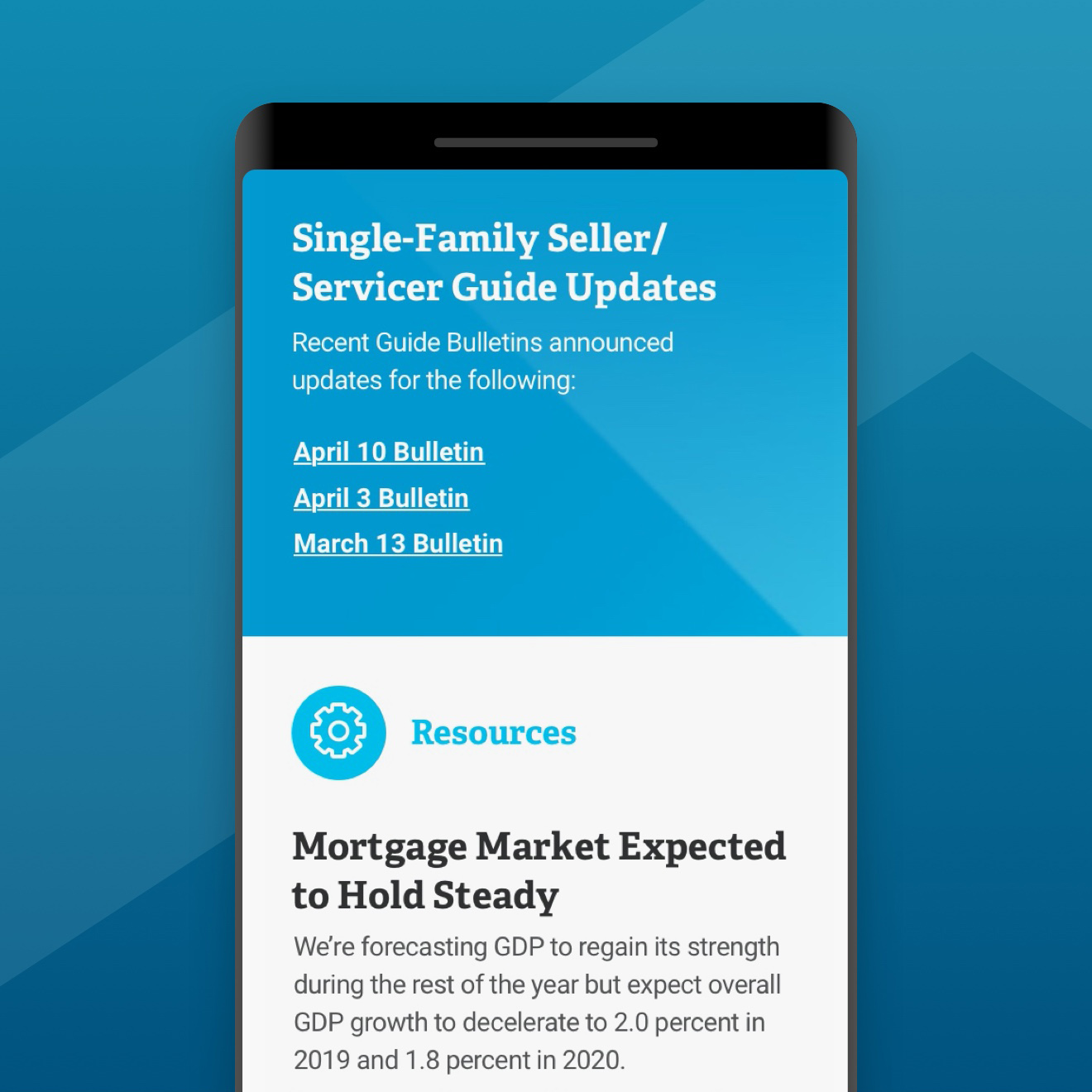
Though Freddie Mac already had an existing style guide, there was an opportunity to create a series of custom illustrations to help break-apart overly dense sections of content.
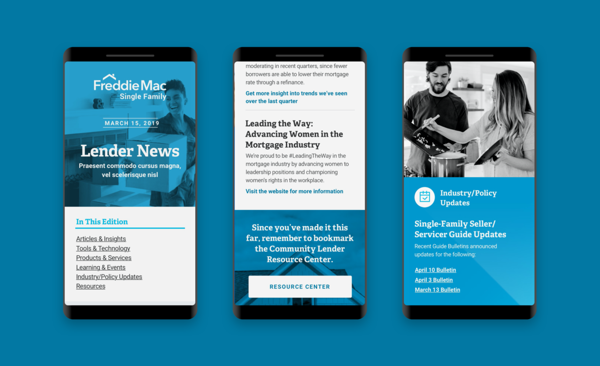
Mobile-first
Data from the Freddie Mac team aligned with current mobile usage trends, and the site was designed with mobile-first thinking in mind to ensure easy access to content regardless of the device.