OCA

Benefits administration has traditionally been a source of annoyance for business owners and employees alike. Why are the interfaces so bad? Why are we the ones that have to adapt to the system? Shouldn’t the system adapt to us? From that idea, OCA was born. OCA puts the power of benefits administration back into the hands of employers and employees.

Project Goal

Innovative ideas demand innovative design. OCA needed a digital presence that showed in vivid detail how different they actually are.

The Solution

We brought the amazing, easy-to-use OCA interface to the front and center of the design, and we overlaid that design on top of rock-solid information architecture that answered the challenge of “do it in as few clicks as possible.”

What we did

  • Strategy
  • Brand Messaging
  • Brand Style Guide
  • Website Development

Custom Treatment

Photos were treated with a custom overlay to match the OCA brand.

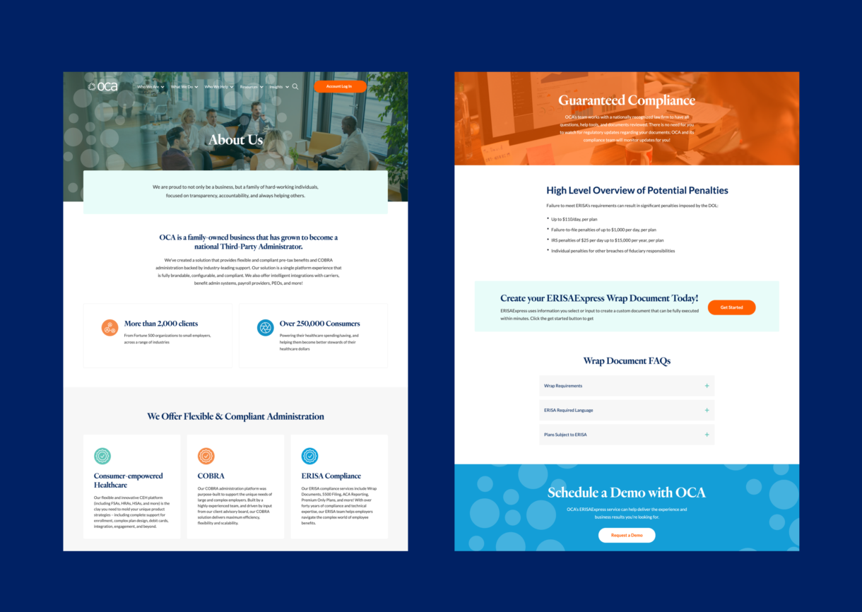
What You See is What You Want

There are few things more frustrating than scouring pages and pages of material just to find the one thing you want. We revamped the navigation to highlight highly-sought pages and simplified the site-wide search so that you’re never more than two clicks away from the thing you need.

The Outcome

With the OCA website, Whitepenny delivered. Want to be a better cook? Start with good ingredients. OCA’s modern approach, and digital-first ethos made for one of the our best websites in recent years.