One of our favorite things to do is get to revisit a brand that we helped develop in the first place. It’s a chance to challenge our own initial assumptions and account for the many ways in which a company has evolved since its launch.
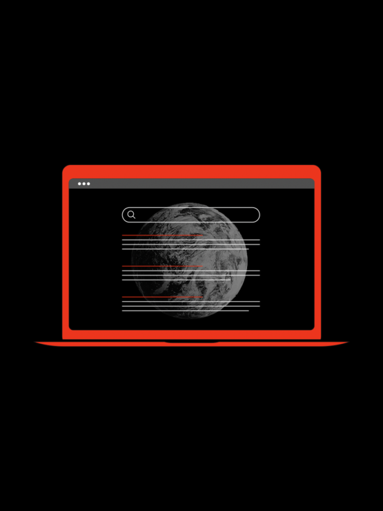
With Bakround, our refresh was based on two core ideas: 1) the brand would at some point transition from a B2B-only offering to also include a B2C strategy, and 2) the company’s foundational messaging had shifted from ‘a place to store your employment information’ to a tool to that can help employers hire smarter and ultimately help applicants advance their careers.
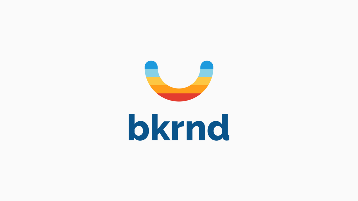
We love Bakround’s aspirations, and we felt that it needed a brand that aligned with its disruptive and ‘new day’ thinking.
We designed a new mark that introduced both an updated palette along with new visual imagery. The idea was a simple one: unite a sunrise-feeling color scheme with a strong / iconic shape (one that would work well for the future app-based nature of the brand). The shape? A smile. Better, more informed hiring processes make for happier employers and happier employees.